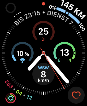
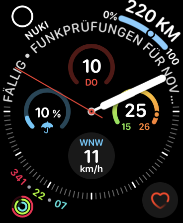
Since the update of iPhone to iOS 14.6 and watchOS to 7.5 the icon of the Nuki app on the watch is different now.
The circle is now grey (instead of the former white) and barely visible. Is this a normal behavior?

Since the update of iPhone to iOS 14.6 and watchOS to 7.5 the icon of the Nuki app on the watch is different now.
The circle is now grey (instead of the former white) and barely visible. Is this a normal behavior?

the icon is realy bad.
This should be fixed with the latest release 2.7.11 (2088).
Hi Elisabeth,
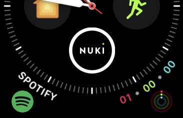
YEP, the Widgets on the iPhone are correct again and on the Watch the circle now is white instead of grey again. But the word “NUKI” Now isn’t perfectly aligned to the icon …


Where is nice circle? This new one looks not really nice!
The former one was neat and fresh, this one is to clunky.
Where is the option to decide for the icon?
Thank you for your feedback. At the moment there is no possibility to choose between the designs.
Why did you change such a nice iconic design?
I hoped that this new clumsy circle was the result of my request to show the lock status right on the watch face. But no, it was just a redesign to the worse 
Feel free to add a feature request so that people can vote for it. Would be interesting for us to see if more people miss the old complications design.